
Home

Partner

New

Explore

  1. Home/
  2. Blog/
  3. Design/
  4. Design Principles From Apple, Google, Airbnb & More (2026)
Design

Design Principles From Apple, Google, Airbnb & More (2026)

The real design principles behind Apple's Liquid Glass, Google's Material 3, Airbnb, Medium, and Facebook — and how to apply them to your own work.

ADPList
ADPList
Nov 1, 2022 · Updated Jul 4, 2026
Design Principles From Apple, Google, Airbnb & More (2026)

Design principles are the short list of beliefs a team uses to make design decisions faster and more consistently. The best product companies write them down, publish them, and use them to settle debates — which means you can borrow their thinking for your own work.

Here are the design principles behind five of the world’s most product-centric companies:

  • Airbnb — Unified, Universal, Iconic, Conversational
  • Apple — Hierarchy, Harmony, Consistency (Human Interface Guidelines)
  • Google — Personal, Adaptive, Expressive (Material 3)
  • Medium — Direction over Choice, Appropriate over Consistent, Evolving over Finalized
  • Facebook — Universal, Human, Clean, Consistent, Useful, Fast

Below: what each principle means in the company’s own words, where to read the source, and how each system has evolved as of 2026.

Airbnb

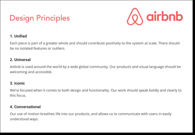
Airbnb’s design principles are Unified, Universal, Iconic, and Conversational. They were written in 2016 by the team behind Airbnb’s Design Language System (DLS), and a decade later they remain one of the most-referenced foundations in design systems work.

Card listing Airbnb’s four design principles — Unified, Universal, Iconic, and Conversational — each with a one-line description
  • Unified: Each piece is part of a greater whole and should contribute positively to the system at scale. There should be no isolated features or outliers.
  • Universal: Airbnb is used around the world by a wide global community. Our products and visual language should be welcoming and accessible.
  • Iconic: We’re focused when it comes to both design and functionality. Our work should speak boldly and clearly to this focus.
  • Conversational: Our use of motion breathes life into our products, and allows us to communicate with users in easily understood ways.

Read more: Karri Saarinen’s Creating the Airbnb Design System and the original essay, Building a Visual Language.

Apple

Apple’s design principles are hierarchy, harmony, and consistency — the three pillars of the Human Interface Guidelines since the Liquid Glass redesign introduced at WWDC 2025 across iOS 26, iPadOS 26, and macOS Tahoe 26.

  • Hierarchy: Prioritize content and controls so people know what’s most important at a glance.
  • Harmony: Align your design with Apple’s hardware and software so the experience feels seamless across devices.
  • Consistency: Use familiar patterns and components — things that look the same should work the same.

The classic HIG principles that shaped a generation of iOS apps haven’t disappeared — they still run through Apple’s guidance:

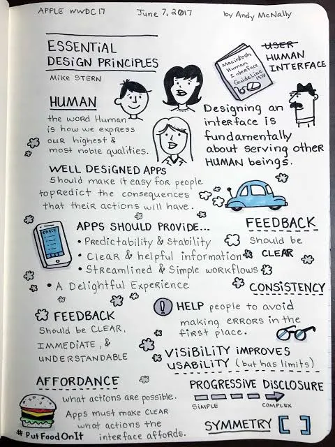
Sketchnote by Andy McNally of Mike Stern’s Essential Design Principles talk at Apple WWDC 2017, covering human-centered design, feedback, consistency, affordance, and progressive disclosure
  • Aesthetic integrity: How well an app’s appearance and behavior integrate with its function. An app for a serious task keeps people focused with subtle graphics and predictable behaviors.
  • Direct manipulation: Manipulating on-screen content directly — rotating the device, using gestures — engages people and helps them understand what’s happening.
  • Metaphors: People learn faster when an app’s virtual objects and actions mirror familiar experiences, whether from the real or digital world.
  • User control: Keep interactive elements familiar and predictable, confirm destructive actions, and make operations easy to cancel — even midway through.

Read more: Apple’s design principles in the Human Interface Guidelines.

Google (Material Design)

Google’s design principles today live in Material 3, a design system built to make products feel personal, adaptive, and expressive. Its 2025 evolution, Material 3 Expressive, is the most-researched update in the system’s history — backed by 46 studies with more than 18,000 participants.

The system has gone through three eras:
  • Material Design (2014): Built on three ideas — material is the metaphor (surfaces, light, and motion behave like physical material), bold, graphic, intentional (print-design fundamentals like typography, grids, scale, and color create hierarchy and focus), and motion provides meaning (motion reinforces the user as the prime mover).
  • Material 3 / Material You (2021): Dynamic color and personalization — the interface adapts to each person’s wallpaper, preferences, and context.
  • Material 3 Expressive (2025): Emotion-forward design through five levers — color, shape, size, motion, and containment — with a new motion-physics system. In Google’s research, people spotted key UI elements up to four times faster in expressive designs.
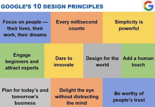
Colorful grid of Google’s ten design principles, including Focus on people, Every millisecond counts, and Simplicity is powerful

Company-wide, Google’s longstanding UX principles — “focus on people — their lives, their work, their dreams,” “every millisecond counts,” “simplicity is powerful” — predate Material and still echo through it.

Read more: Material Design 3 and Google’s research on expressive design.

Medium

Medium’s early design principles were Direction over Choice, Appropriate over Consistent, and Evolving over Finalized — written by former Head of Design Dustin Senos. The “X over Y” format forces a real trade-off, which is why this set is still quoted a decade later.

  • Direction over Choice: Medium traded layout, type, and color choices for guidance and direction. They wanted people to focus on writing, not get distracted by options.
  • Appropriate over Consistent: Controversial on its face, but clear in practice — Medium was willing to break consistency when it was more appropriate for the OS, device, or context.
  • Evolving over Finalized: Shared drafts, responses, and notes made content antifragile — improving with use and evolving over time.

Read more: Dustin Senos, Creating useful design principles.

Facebook

Facebook’s classic design principles are Universal, Human, Clean, Consistent, Useful, and Fast — published in 2009 as the product scaled to a global audience. The original note is no longer online, but the full set is preserved at Design Principles FTW.

  • Universal: Design needs to work for everyone — every culture, every language, every device, every stage of life. Build for 90% of users and cut features that only serve a minority, even at a short-term cost.
  • Human: The voice and visual style stay in the background, behind people’s voices, faces, and expression.
  • Clean: A clean, understated visual style creates a blank canvas on which users live. A minimal, well-lit space encourages participation and honest communication.
  • Consistent: Embrace patterns — usability improves when similar parts are expressed in similar ways. Reduce, reuse, don’t redesign.
  • Useful: Streamline the core interactions people use daily; purge unnecessary clicks and wasted space.
  • Fast: Faster experiences are more efficient and feel more effortless.

Read more: Facebook’s design principles (archived).

How to apply these principles to your own work

Don’t copy any of these word for word — they were written for a specific product, team, and moment. Steal the format instead:

  1. Keep it to three to five. Every company above fits on an index card. A list of ten principles is a list nobody uses.
  2. Make them decisive. The best principles pick a side, like Medium’s “Appropriate over Consistent.” If the opposite of your principle isn’t a position someone could reasonably hold, it’s a platitude, not a principle.
  3. Anchor them in what makes your product different. Airbnb’s “Universal” exists because its community spans the globe; Facebook’s “Fast” exists because it’s a daily utility.
  4. Pressure-test them with people who’ve done it. A 30-minute session with a UX design mentor who has written principles for a real product will sharpen yours faster than another week of wordsmithing.

If you’re building a design practice — or the design system to go with your principles — ADPList’s 40,000+ mentors across 140+ countries offer free 1:1 sessions. Start with the design mentorship guide or browse product design mentors. For the bigger picture on where to find guidance, see the best mentorship platforms in 2026.

Frequently asked questions

What are Apple's design principles?

Apple’s Human Interface Guidelines are built on three design principles: hierarchy (prioritize content and controls so people know what matters at a glance), harmony (align your design with Apple’s hardware and software), and consistency (use familiar patterns — things that look the same should work the same). These became the HIG’s pillars with the Liquid Glass redesign introduced at WWDC 2025.

Classic HIG ideas — direct manipulation, metaphors, feedback, and user control — still run through Apple’s guidance at developer.apple.com/design.

What is Material Design?

Material Design is Google’s open-source design system, first launched in 2014. The current version, Material 3, is built to make products feel personal, adaptive, and expressive — and its 2025 update, Material 3 Expressive, adds emotion-forward color, shape, motion, and a physics-based motion system, backed by 46 research studies with 18,000+ participants.

The full system — components, tokens, and guidelines — is free at m3.material.io.

What makes a company design-driven?

Design-driven companies share three habits: they write their design principles down and actually use them to settle product debates; they invest in design systems so quality scales beyond individual designers; and design has a seat at the strategy table rather than being a styling step at the end.

Apple, Google, and Airbnb all publish their design thinking openly — a good signal that design is treated as a core competency, not a service function.

How do I apply big-company design principles to my own work?

Don’t adopt another company’s principles verbatim — they encode that company’s specific trade-offs. Instead, borrow the format: write three to five principles, make each one decisive (Medium’s “Appropriate over Consistent” picks a side), and anchor them in what makes your product different.

Then pressure-test them with experienced designers — a free session with a product design mentor on ADPList is a fast way to find the weak spots.

What is the difference between design principles and a design system?

Design principles are the beliefs that guide decisions — short, opinionated statements like Airbnb’s “Unified” or Facebook’s “Fast.” A design system is the implementation: the components, design tokens, and documentation that encode those beliefs into reusable parts.

Principles come first; the system makes them repeatable at scale. Airbnb’s Design Language System is the classic example of principles translated into a working system.

ADPList
ADPList
On a mission to democratize mentorship for all. ADPList is a community where people can find, book and meet mentors around the world. · ADPList

Get advice from a design mentor — free

Book a free 1:1 session with one of 40,000+ verified mentors on ADPList.

Find a mentor

Keep reading

The Must-Have Tools for UX Designers
Design

The Must-Have Tools for UX Designers

Get to know the latest UX Designers Must-Have Tools here with mentors, Ann Criqui and Joy Liu!

Ann CriquiAnn Criqui·Feb 27, 2024
Generative AI and Creative Work: Explore the Powerful Link
Design

Generative AI and Creative Work: Explore the Powerful Link

What changes will a collaboration between generative AI and creative work bring to the playing field? We see what we can expect from GenAI.

Reena AggarwalReena Aggarwal·Jan 19, 2024
The Definitive Guide To A Creative Website Design [2023]
Design

The Definitive Guide To A Creative Website Design [2023]

If you're looking to build a website that grabs attention and leaves a lasting impression, read on. We'll show you how to.

Burkhard BergerBurkhard Berger·Aug 3, 2023

On a mission to democratize mentorship for all.
Designed and made with 🖤 by ADPList Team

© Copyright 2026 - ADPList

Company

About usContactPartnershipBlog

Product

Find a mentorBecome a mentorAI Interview CoachAI Design Masterclass

Support

FAQsHelp centerTerms of servicePrivacy policySite map

Follow us

LinkedInXInstagramYoutube

Resources

AI Design GuideDesign Moonshot BookFree resumé AI tool

© Copyright 2026 - ADPList